
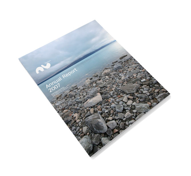


Nu is one of a number of projects over the years that never saw the light of day – I've included it because I was (and still am) really pleased with how it turned out. Nu Telecom was to be a reinvention of Telecom New Zealand. The numerous flights to Auckland and resulting project carbon footprint justify its inclusion here. The idea was really simple, the name comes from the idea for taking two ‘U’s and then inverting one. So the line ‘For you and you’ describes the idea, the name and the mark. The palette and look came from travelling around NZ. The mark was designed to look like it could have washed up on the shore of one of New Zealand’s many glacial lakes. Like I said, Nu never happened, but I still really like the way it turned out.